[Role]
Co-led an on-going redesign on the loan application tool with senior designers. Conducting user research and iterative usability testing.
[About]
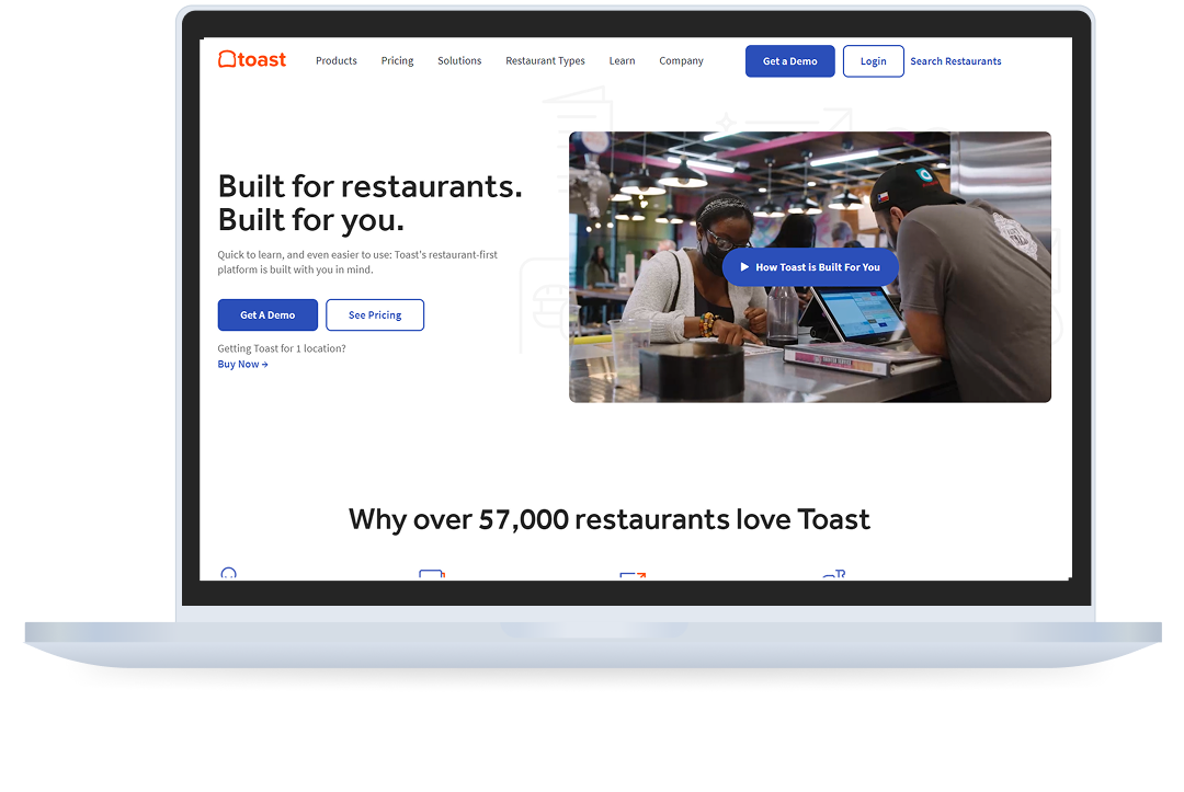
Toast is a cloud-based restaurant management software company that provides an all-in-one point of sale system that helps restaurants improve operations, increase sales, and enhance guest experiences.
Toast Capital is a tool used by over thousands of restaurants to help fund and power restaurants.
[Collaborators]
Manager - Lisa Agustin
Product Designer - SooHo Choi
Sr. Product Manager - Lauren Folk
Sr. Product Designer - Martin Reilly
Sr. Researcher - Sabina Cao
[Tools]
Figma
This project is about redesigning the loan tool application for restaurant owners to make loan applications easy to understand for first-time applicants, and to personalize loan package projections.

Currently, only 1% of Toast customers are enrolled in Toast Capital loans. Why could this be?
✸ Taking out a loan can be a confusing and overwhelming process due to financial jargon being inaccessible to those who aren’t as familiar with financial terms.
✸ It's difficult to see which loan option or term is best fit for the customer’s needs and therefore discourages the customer from choosing any option.
How might we make Pre-Qualified offers easier to understand and digest as someone not familiar with our product?
To create a guided, scalable loan tool that allows our customers to easily customize a loan option based on viewing different loan outcomes in order to help them decide on a loan that’s best suited to their needs.
✸ By offering flexible and customizable loan options, customers will be more inclined to take out a loan that aligns with their needs and at the comfort of their restaurant's health.
✸ Providing educational material and defining financial terms will assist in guiding first-time applicants, it will decrease barriers associated with financial jargon.
Prior to hopping on this project, the Capital team sent out a survey to Toast customers. After reading the results, I found these key themes:
1. Unfamiliarity with Toast Capital is the #1 reason why non-converters haven't applied yet.
2. There are 3 main concerns when it comes to applying for a loan:
"How will this help out my restaurant?"
"What does my business need this for?"
"I've never used this before. How does it work?"
"What does this mean?"
I looked at different competitors who offered loan tools to see which sliders are most important in helping a customer make a decision, and to see any patterns that exist.

With the engineering team, we did Crazy 8 sketches to come up with these most voted on ideas. Some features that stood out to the team included:
1. The amount of control we wanted to give to the user for the scale and the different parameters they can control.
2. What resources we could give to help the user build trust and familiarity with Toast Capital.


The ideas that were voted most upon included customizable tools in the loan application, along with text material that helped inform the user of loan detail varied outcomes and what each of these details mean.
One of the biggest decisions made during this step was to leverage control of alternate outcomes. AKA we wanted the user to play around with certain parameters without being overwhelmed with how much they could play with.
Another big decision was where to place the financial literacy aid to support the interactive component, avoiding inhibiting not inhibit the scalable tool as the main interactive component.
To validate if customers are able to understand how to craft their loan offers and what actions need to be taken to move forward, and to gauge whether the presence of the 5 financial definitions gives customers enough confidence and guidance to interact with the loan projection tool.
Created an unsupervised usability testing plan with our UX Researcher and Sr. Product Designer that would ask subjects to go through the first iteration of our prototype.


I shared many fun, special moments with interns and my teams, including intern jeopardy, game nights with the Capital team, and a virtual magic show with the Fintech team.

During my 3 months at Toast, I was given much freedom over what I wanted to learn and was given an environment where I got to own my work from start to finish, with the help of the huge support system that my team gave me. Here are some takeaways from my experience:
One of my goals for this internship was to figure out what my ideal work would consist of. In order to figure this out, I set up multiple weekly 1:1s with designers, researchers, managers, and engineers to learn more about them, the decisions that led them to their careers, and what their daily tasks are like.
I would ask them about opportunities where I could try out different things or shadow meetings which eventually led me to work on projects outside of my main scope and learn more about the direction that I want my career to go in.
Initially, I was intimidated by design reviews and was under the impression that I should present polished work during these critique sessions. I soon realized how important collaboration is regardless of what step I’m at in my design process. I realized that having constant feedback on my work even in its bare bones state was super valuable and helpful to me in creating action items in the right direction.


